Solution Recipes are tutorials to achieve specific objectives in Klaviyo. They can also help you master Klaviyo, learn new third-party technologies, and come up with creative ideas. They are written mainly for developers & technically-advanced users.
Note: We do our best to make sure any code and API references are accurate and current when this is published, but you might need to update code and it’s always a best practice to leverage ourlatest API versions. If you have questions, feel free to hop over to ourDeveloper Community.
How to create a customizable Product Block-like Text block using Klaviyo’s native features and Django Template Tagging.
The prebuilt Product Block provides some easy-to-use preset functionality, but it might not cover 100% of business/marketing cases.
High
Introduction
Klaviyo’s template editor allows you to use a preset block called the Product Block. This block lets you choose from a selection of filtered/weighted Product Feeds which pull from your Catalog. In addition to this, Klaviyo provides a range of default Django and custom built template tagging syntax to let you customize the look, feel and personalization of our email templates.
Challenge
While the default setup and options for the Product Block work for most businesses, there are a handful of use-cases which can warrant a more customized approach. Because of the nature of the default block and the need to support its functionality at scale, customization options are relatively limited.
Note: this block setup requires custom html and template tagging/Django. As such, its troubleshooting is not supported by our Support team. Please take this into consideration if you plan to use this approach in your account.
Ingredients
- 1 Catalog — Synced via one of our ecommerce integrations or using our Custom Catalog feature
- 1 Product Feed — A filtered list of products that optionally can be weighted by various factors
- 1 Product Block — A block in an email template that’s able to natively access our Product Feeds
- 1 scoop template tagging experience
- 1 pinch HTML formatting experience
Prerequisites
This recipe requires a relatively good understanding of template tag usage/structure, email HTML design, and the concepts of conditional logic and loop iteration. Beyond these, most of the tools you’ll need are likely already in the platform!
Quick tips
Before we get started, here are some quick tips for playing around with data in templates.
Previewing objects
There are a few data objects being used in the examples below but we won’t go into detail about all of the existing data on each of these objects. Instead, you can preview the available data by just printing out that object on the template itself after it’s initialized. For example, if you want to see all of the available fields on the catalog_item initialized by a Catalog Lookup, you can print it out in a template by adding the tag:
{{ catalog_item }}by itself within that Catalog Lookup scope (i.e. between the {% catalog %} and {% endcatalog %} tags). After adding this tag, save the block and preview it to see a full list of available fields for that object.
Troubleshooting
The steps in this recipe are laid out incrementally so you can see what each step adds or changes from the previous one. When setting up this customized Product Block (or any custom HTML content within a template), make sure to change one thing at a time, saving and previewing as you progress. If something was mis-typed in your setup, it will be easier to catch the error if fewer things changed from the previous working version.
Instructions
Step 1: Set up a Catalog in Klaviyo
Integrate with one of our prebuilt ecommerce integrations or reach out to our Support Team for instructions on how to get set up with our Custom Catalog feature. You can check if you have items in your Catalog by navigating to the Catalog landing page in your account.
Context: This step guarantees we have actual items to work with in the final template. If the catalog is empty, this customized “Product Block” won’t have anything to display.
Step 2: Set up a Product Feed
Head to the Product Feed section of the account and set up the type of feed you’d like to display with this custom block. For the example outlined in this recipe, let’s call this feed “ExampleProductFeed”.
Context: Product Feeds generate a per-profile weighted list of items from the Catalog on your account and the chosen parameters/metric(s) on the feed’s settings. Without this, we won’t know which items to show the person receiving the final email.
Step 3: Add a Product Block to a template
Drag a Product Block into your template and select the Product Feed you made in the previous step.
Context: Product Blocks themselves play a special role in this setup. In order for a Product Feed’s information to be accessible within a template, that feed must be “primed” for that template, basically the template needs to know what feed to load before attempting to render itself. To do this, we can take advantage of our native Product Block which allows you to select a Product Feed and is designed to prime that feed for the email.
Step 4: Set the Product Block visibility to False
Set the show/hide block feature logic for this Product Block to False.
Context: We need a default Product Block in this email during template render time in order to “prime” the Product Feed we want to use. That said, we don’t want both the default and customized Product Blocks to appear in the final email sent to the recipient, we only need it to “prime” the feed when the template renders. Our show/hide block feature evaluates before send time so anything evaluating to false will be removed from the final email (rather than just hidden). We can easily set this default block’s display conditions to evaluate as false and guarantee it isn’t included in the final email by just setting its display condition to False.
Step 5: Add a Text Block to a template
Drag a Text Block into your template below the Product Feed.
Context: Text Blocks provide a lot of customization power in our templates by not enforcing much default formatting and allowing you to access the “source” of the block to add HTML and Django template tagging. We’ll be using this feature of these blocks to create our own Product Block.
Step 6: Add an HTML table within an HTML table to the Text Block
Add a basic HTML table within another HTML table to your Text Block:
<table>
  <tbody>
    <tr>
      <td>
        <table>
          <tbody>
            <tr>
              <th></th>
            </tr>
          </tbody>
        </table>
      </td>
    </tr>
  </tbody>
</table>
Context: Our Product Block displays items in a grid using a number of rows and columns. In order to mimic this behaviour, we can use an HTML table. For ease of formatting later, we’re using 2 nested tables. One for the general structure of the grid of items and one for each item in that grid (in order to display that item’s information).
Step 7: Use a “with” statement to reference the Product Feed
Add a with statement so we can refer to the primed Product Feed with an easy name (eg. “product_feed”). Make sure to close the with statement with an “endwith”:
{% with product_feed=feeds.ExampleProductFeed %}
<table>
  <tbody>
    <tr>
      <td>
        <table>
          <tbody>
            <tr>
              <th></th>
            </tr>
          </tbody>
        </table>
      </td>
    </tr>
  </tbody>
</table>
{% endwith %}
Context: Now that we have a general structure to work within, we need to somehow reference the Product Feed we primed earlier. We can do this by calling it as a variable using a “with” statement. “feeds” in this case is a reserved name which contains a reference to all primed feeds for this template.
Step 8: Pull in the name of the first item in the feed
Use a lookup on product_feed to get the ID of the first item, then use that ID to look up the same item in the Catalog using a Catalog Lookup and pull that item’s name into the HTML table. If you preview the template now, you should be able to see the name of the first item in the selected Product Feed.
{% with product_feed=feeds.ExampleProductFeed %}
<table>
  <tbody>
    <tr>
      <td>{% catalog product_feed.0.item_id %}
        <table>
          <tbody>
            <tr>
              <th>{{ catalog_item.title }}</th>
            </tr>
          </tbody>
        </table>
      {% endcatalog %}</td>
    </tr>
  </tbody>
</table>
{% endwith %}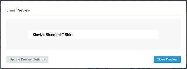
Context: The Product Feed contains a weighted list of items for a given profile but only certain information about these items based on what our default Product Block uses. To access all of the information about a given item from the Catalog, we need to look that item up based on its ID. “item_id” above is a reserved name for the ID of a given item in a Product Feed. The Catalog Lookup is added inside the exterior table but on the outside of the interior table since each interior table should represent a single item.
Step 9: Add a “for loop”
Add a for loop to the outside of the “table data” (<td>) around the interior table and refer to each item in the Product Feed dynamically:
{% with product_feed=feeds.ExampleProductFeed %}
<table>
  <tbody>
    <tr>{% for item in product_feed %}
      <td>{% catalog item.item_id %}
        <table>
          <tbody>
            <tr>
              <th>{{ catalog_item.title }}</th>
            </tr>
          </tbody>
        </table>
      {% endcatalog %}</td>
    {% endfor %}</tr>
  </tbody>
</table>
{% endwith %}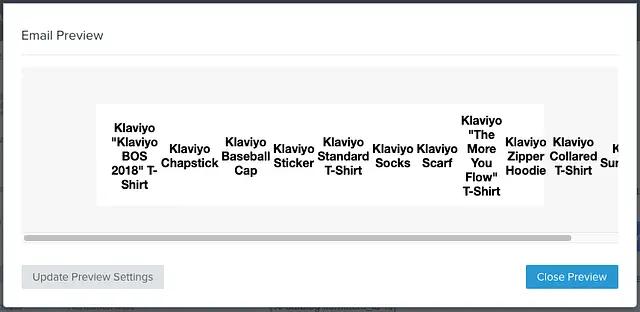
Context: We have the name of one item displaying but ideally we want to display more, in this example let’s say 6. Instead of creating 6 copies of the same interior table and catalog lookup but referring to the first 6 items, let’s use a for loop instead. We want to display these items side-by-side so instead of just wrapping the interior table itself, we want to wrap the table data element around that table. Each table data (or table header) element creates a new column in an HTML table. In other words, creating table data elements in a loop will generate side-by-side items in the table.
Step 10: Calculate columns/rows
Add some new variables to the with statement for the number of items we want and the number of items per column. In this case, the total number of items we want to display is achieved by “slicing” the product_feed to that number of items (6 in this example). The number of columns per row is achieved by setting “columns” as a variable (3 in this example) and toggling a new row when we hit that number:
{% with columns=3 product_feed=feeds.ExampleProductFeed|slice:":6" %}
<table>
  <tbody>
    <tr>{% for item in product_feed %}
      <td>{% catalog item.item_id %}
        <table>
          <tbody>
            <tr>
              <th>{{ catalog_item.title }}</th>
            </tr>
          </tbody>
        </table>
      {% endcatalog %}</td>
    {% if forloop.counter|divisibleby:columns %}</tr><tr>{% endif %}
    {% endfor %}</tr>
  </tbody>
</table>
{% endwith %}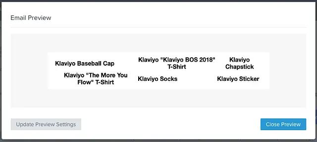
Context: If you preview the table now, you’ll see 6 item names, side-by-side, likely going off the edge of the email template. To avoid this, we need to add some logic to handle wrapping items onto the next line. The wrapping logic here takes advantage of a for loop counter variable provided by Django (foorloop.counter) and a boolean expression for whether the provided number is divisible by another (divisibleby) and wraps these as an if statement around an end/start of a new table row element (<tr>).
Step 11: Pull in images
Now that we have some basic structure down, let’s flesh out what gets displayed. First, let’s pull in an image for each product by adding another table row above the title row:
{% with columns=3 product_feed=feeds.ExampleProductFeed|slice:":6" %}
<table>
  <tbody>
    <tr>{% for item in product_feed %}
      <td>{% catalog item.item_id %}
        <table>
          <tbody>
              <tr>
                <th><a href="{{ catalog_item.url }}"><img alt="{{ catalog_item.title }}" src="{{ catalog_item.featured_image.thumbnail.src }}" /> </a></th>
              </tr>
            <tr>
              <th>{{ catalog_item.title }}</th>
            </tr>
          </tbody>
        </table>
      {% endcatalog %}</td>
    {% if forloop.counter|divisibleby:columns %}</tr><tr>{% endif %}
    {% endfor %}</tr>
  </tbody>
</table>
{% endwith %}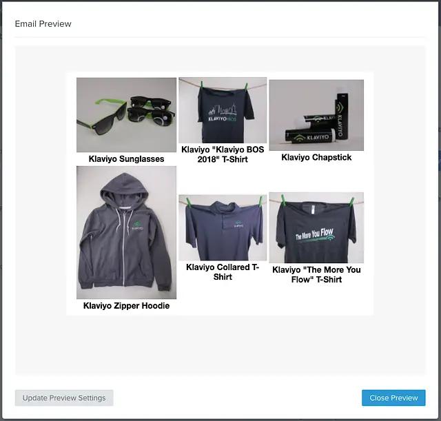
Step 12: Pull in prices
Let’s add in some prices for each item. Pull the price number in from the catalog and format it in the Account or email’s native currency using the “currency_format” tag and “floatformat” filter:
{% with columns=3 product_feed=feeds.ExampleProductFeed|slice:":6" %}
<table>
  <tbody>
    <tr>{% for item in product_feed %}
      <td>{% catalog item.item_id %}
        <table>
          <tbody>
              <tr>
                <th><a href="{{ catalog_item.url }}"><img alt="{{ catalog_item.title }}" src="{{ catalog_item.featured_image.thumbnail.src }}" /> </a></th>
              </tr>
            <tr>
              <th>{{ catalog_item.title }}</th>
            </tr>
            <tr>
               <td>
                  <p>
                      {% if catalog_item.metadata|lookup:"$price" %}
                          {% currency_format catalog_item.metadata|lookup:"$price"|floatformat:2 %}
                      {% elif catalog_item.metadata|lookup:"price" %}
                          {% currency_format catalog_item.metadata|lookup:"price"|floatformat:2 %}
                      {% endif %}
                  </p>
               </td>
            </tr>
          </tbody>
        </table>
      {% endcatalog %}</td>
    {% if forloop.counter|divisibleby:columns %}</tr><tr>{% endif %}
    {% endfor %}</tr>
  </tbody>
</table>
{% endwith %}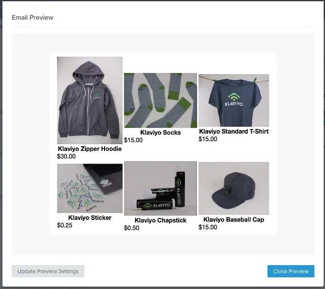
Step 13: Add a button
The image above is linked, but buttons can provide a more clear call-to-action so let’s add one of those to each item
{% with columns=3 product_feed=feeds.ExampleProductFeed|slice:":6" %}
<table>
  <tbody>
    <tr>{% for item in product_feed %}
      <td>{% catalog item.item_id %}
        <table>
          <tbody>
              <tr>
                <th><a href="{{ catalog_item.url }}"><img alt="{{ catalog_item.title }}" src="{{ catalog_item.featured_image.thumbnail.src }}" /> </a></th>
              </tr>
            <tr>
              <th>{{ catalog_item.title }}</th>
            </tr>
            <tr>
               <td>
                  <p>
                      {% if catalog_item.metadata|lookup:"$price" %}
                          {% currency_format catalog_item.metadata|lookup:"$price"|floatformat:2 %}
                      {% elif catalog_item.metadata|lookup:"price" %}
                          {% currency_format catalog_item.metadata|lookup:"price"|floatformat:2 %}
                      {% endif %}
                  </p>
               </td>
            </tr>
            <tr>
              <td>
                <p><a href="{{ catalog_item.url }}">Buy Now</a></p>
              </td>
            </tr>
          </tbody>
        </table>
      {% endcatalog %}</td>
    {% if forloop.counter|divisibleby:columns %}</tr><tr>{% endif %}
    {% endfor %}</tr>
  </tbody>
</table>
{% endwith %}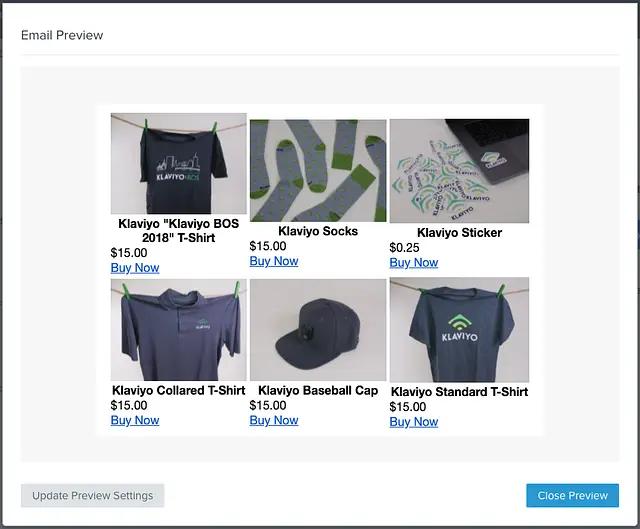
Context: A button in email HTML is basically a link in a styled block element (eg. a paragraph or div). The above example starts with a basic link in a paragraph element, we’ll style it later.
Step 14: Add some styling
All the data and structure are there now, but you may notice a few things that seem off:
- If you product images that aren’t a standardized size/shape, they will appear differently and shift other elements of each product in the table (eg. shifting the names up and down)
- If your product names vary considerably in length, they may shift other product elements up and down
- The item price isn’t centered
- The “buy now button” isn’t a button and isn’t centered
To fix these formatting concerns, we need to add some CSS styles and HTML attributes to some of these elements. You can format these however you like at this point, but we’ve provided an example of how to do this with the customized Product Block we’ve been building so far. Add a class to each element that you’d like to format and at the top of your Product Block code, add a style element with some formatting for each of those classes (note, some of the styles are tagged with “!important” to override any default settings you have on your template for things like link formatting):
{% with columns=3 product_feed=feeds.ExampleProductFeed|slice:":6" %}

<style type="text/css">
  .custom_product_block_table {
    margin-left:auto;
    margin-right:auto;
    width: 100%;
  }
  .custom_product_block_text {
    text-align:center;
  }
  .custom_product_block_image_cell {
    height:120px;
  }
  .custom_product_block_image {
    max-height:120px;
    max-width:180px;
  }
  .custom_product_block_title_cell {
    height:60px;
    vertical-align: text-top;
    text-align:center;
  }
  .custom_product_block_price_cell {
    height:20px;
    vertical-align: text-top;
  }
  .custom_product_block_button {
    display: inline-block;
    padding-top:10px;
    padding-bottom:10px;
    font-size:16px;
    border-radius:5px;
    padding-left:10px;
    padding-right:10px;
    background-color:#11CC50;
    font-family:"Helvetica Neue", Arial;
    text-decoration: none !important;
    color:#FFFFFF !important;
    font-weight:bold !important;
  }
</style>

<table class="custom_product_block_table">
  <tbody>
    <tr>{% for item in product_feed %}
      <td>{% catalog item.item_id %}
        <table class="custom_product_block_table">
          <tbody>
              <tr>
                <th><a href="{{ catalog_item.url }}"><img alt="{{ catalog_item.title }}" class="custom_product_block_image" src="{{ catalog_item.featured_image.thumbnail.src }}" /> </a></th>
              </tr>
            <tr>
              <th class="custom_product_block_title_cell">{{ catalog_item.title }}</th>
            </tr>
            <tr>
               <td class="custom_product_block_price_cell">
                  <p class="custom_product_block_text">
                      {% if catalog_item.metadata|lookup:"$price" %}
                          {% currency_format catalog_item.metadata|lookup:"$price"|floatformat:2 %}
                      {% elif catalog_item.metadata|lookup:"price" %}
                          {% currency_format catalog_item.metadata|lookup:"price"|floatformat:2 %}
                      {% endif %}
                  </p>
               </td>
            </tr>
            <tr>
              <td>
                <p class="custom_product_block_text"><a href="{{ catalog_item.url }}" class="custom_product_block_button">Buy Now</a></p>
              </td>
            </tr>
          </tbody>
        </table>
      {% endcatalog %}</td>
    {% if forloop.counter|divisibleby:columns %}</tr><tr>{% endif %}
    {% endfor %}</tr>
  </tbody>
</table>
{% endwith %}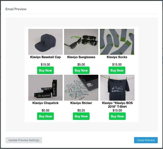
Context: You’ll notice some of the styling tricks used in the elements above are used to account for variances in information stored for each item. For example, the table header and table data elements used for the item “title” and “price” are locked to a certain height minimum and aligned to the top of their given cell. This allows us to account for variances in the length of an item’s title or the inclusion of multiple prices while still making the text appear aligned with other items on the same row in the template.
💡 NOTE: The basic example styling above does not necessarily account for all nuances of some inbox services (like Outlook) which do not respect certain style properties (especially on images). It is highly recommended that you standardize the size of all of your catalog images to squares with a width/height of ~200px to avoid any potential issues or at least add additional styling for these cases if you are unable to standardize these images.
Bonus: Manual product selection
Dynamic recommendations are great, but what if you want to select products manually from the catalog? You may notice that while you can manually select items in our default Product Block, the customized one built in this recipe still relies on the name of a Product Feed in order to work. In order to get around this requirement there’s one aspect of this block we can take advantage of: the for loop iterates through a list of products and looks up their IDs in the catalog. Instead, we can provide a list of IDs we already know and just look those up in the catalog. To do this, you’ll need to update the “with” statement and the beginning of the tables from this
{% with columns=3 product_feed=feeds.ExampleProductFeed|slice:":6" %}
...
  <tbody>
    <tr>{% for item in product_feed %}
      <td>{% catalog item.item_id %}
        <table>
...
to something like this (assuming these product IDs are 123, 456, and 789):
{% with columns=3 product_feed="123,456,789" %}
...
  <tbody>
    <tr>{% for item_id in product_feed|split:"," %}"
      <td>{% catalog item_id %}
        <table>
...
This example
- replaces the “product_feed” with a comma-separated string of item IDs
- uses a “split” filter to turn that string into a list
- loops through each ID in that list for the catalog lookup
Bonus: Sale prices vs. regular prices
If you have a setup that includes both sale and regular prices for items, you can add some formatting that changes how these display. For example, if a sale price exists and is lower than the regular price, you might want to show the regular price with a strikethrough and the sale price. This can be achieved using some if statements like in the example below:
...
            <tr>
              <td class="custom_product_block_price_cell">
                {% with price=catalog_item.metadata.price|floatadd:"0" compare_at_price=catalog_item.metadata.compare_at_price|floatadd:"0" %}
                  <p class="custom_product_block_text">
                  {% if compare_at_price and price < compare_at_price %}
                    <strike>{% currency_format compare_at_price|floatformat:2 %}</strike><br>
                    {% currency_format price|floatformat:2 %}
                  {% else %}
                    {% currency_format price|floatformat:2 %}
                  {% endif %}
                  </p>
                {% endwith %}
              </td>
            </tr>
...
We use the filter “floatadd” here with 0 to ensure the price being use is interpreted as a float rather than a string for the comparison. This example also assumes there is a metadata property called “compare_at_price” for catalog items, the name of this property may vary depending on your integration or custom catalog setup.
Impact
Klaviyo’s default product block can provide a lot of utility without the need for complex setup, but sometimes you just need to make your own minor tweaks and branding updates outside of the capabilities of this block. Using the setup described here, your Product Blocks can be more on-brand and customized to your businesses particular style.
