We’re thinking it, you’re thinking it—email pop-up forms are annoying.
We’re all consumers. We’ve all closed out of a site pop-up, exasperated that it interrupted what we were trying to find.
Yet pop-up forms persist as a brand-building tactic that works—so much so that many businesses can’t justify removing them from their websites.
If your business is getting significant web traffic every month, conversions from pop-up forms can make up a big chunk of list building, communication, and revenue opportunities.
While it’s tempting to consider removing email and sign-up pop-up forms from your website altogether, the data indicates that without them, you’d be doing your ecommerce store a disservice.
The goal is to make pop-ups more effective and less intrusive—and that’s what you’ll learn how to do here, with plenty of examples for inspiration.
If you’d like, skip to:
- What is an email pop-up?
- Email pop-up use cases
- Types of pop-ups
- Email pop-up best practices
- How to set up a successful email pop-up
- Email pop-up FAQs
What is an email pop-up?
An email pop-up is a window with form fields that appears on a website. Pop-ups prompt visitors to enter their email address, usually in exchange for something, as a way for brands to get permission to communicate with them via email.
Email pop-ups are one of the most common and effective email list building strategies. The larger your email list, the bigger an audience you have to spread the word about your brand—and the more chances you have to nurture subscribers toward making their first purchase or turning customers into brand champions.
5 common use cases for email pop-ups
Most marketers feel deeply conflicted about email pop-ups. The data shows they work, but they often frustrate consumers, who experience them as a nuisance to their shopping experience.
What’s happening?
First, most people have accepted that email and sign-up pop-ups are common on websites.
For the people who aren’t ready to subscribe, dismissing pop-ups is easy—if you’ve set them up properly.
For the people who are ready to subscribe or opt-in, pop-ups are one of the easiest ways to do it.
If you don’t have an email pop-up on your website, it’s not as if people are leaving your website feeling over the moon that they didn’t encounter one—and you’re losing out on subscribers anyway. It’s a lose-lose.
This is why Backlinko’s Brian Dean trialled an email pop-up on his website and ended up increasing his subscription numbers from 35 per day to 75 per day with a 3.42% conversion rate.
We’ll get into best practices below, but first we want to describe context—because it’s a huge part of what determines the success of your pop-up. Read about these 5 pop-up use cases before you start writing:
1. Grow your email list
At its most basic level, the goal of your email pop-up form is to grow your subscriber list. But this goal is only a stepping stone, because your real goal is to grow your list of potential customers.
You don’t need to offer a discount to grow your email list. A recent analysis of Klaviyo data found that both email and SMS sign-up forms with coupons perform slightly better than those without (by 0.52% and 0.37%, respectively)—but not at a level of statistical significance.
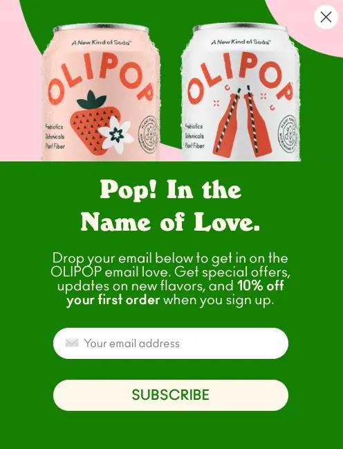
Whether you offer a discount or not, the most important thing is to be clear about the exchange. Answer the question, “What’s in it for the subscriber?” Then clearly express the reward for signing up, like Olipop does here: “Get special offers, updates on new flavours, and 10% off your first order when you sign up.”
2. Communicate a seasonal or special promotional offer
If you’re running multiple offers, a pop-up can be a great way to consolidate them so they’re easier to find. Customers will appreciate the discount code transparency and have more of an incentive to purchase—but if they’re not ready to buy, you can slip in an ask for an email address, too.
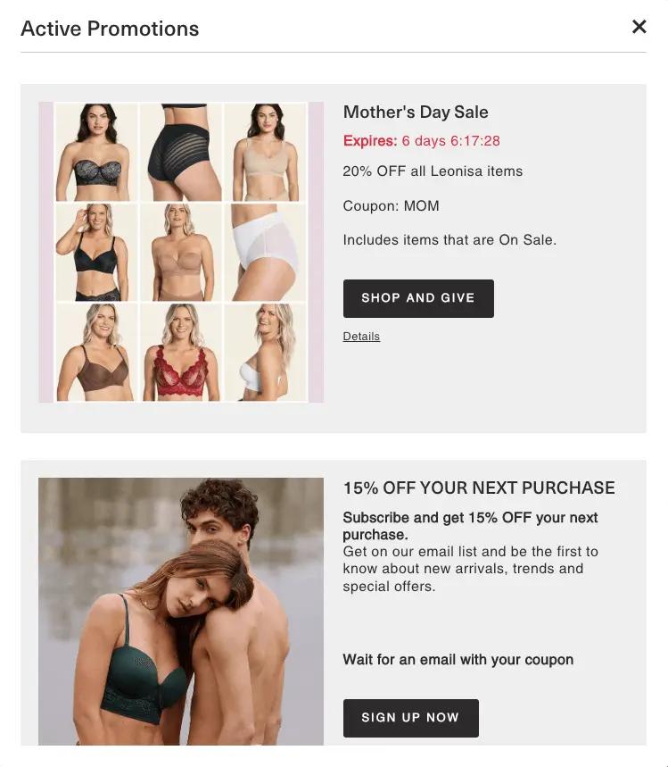
Check out this example from Leonisa , which highlights their Mother’s Day Sale with a countdown timer. For people who aren’t ready to convert on their primary offer, they offer the second option of subscribing to their list for 15% off.
3. Encourage customers to check out their cart
You’ve heard of the abandoned cart email, but a lot of brands try to get ahead of them with a pop-up.
When someone places an item in their cart and changes their mind, a pop-up can encourage them to go back and complete the purchase. Here are some common cart pop-up incentives:
- A discount that expires on a visible countdown with a timer
- Free shipping or an upgrade to faster shipping
- Free products to try as samples
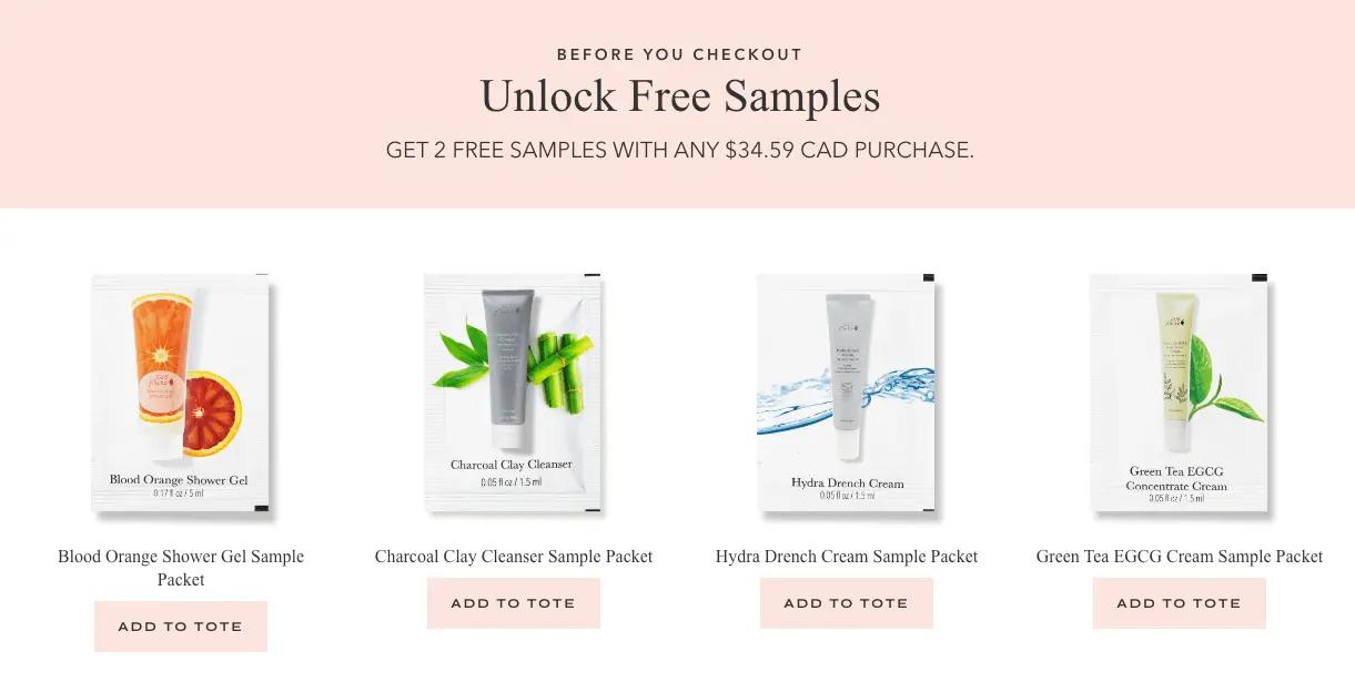
This example from 100% Pure sweetens the deal with two samples, and gives the customer a few choices to customise their own order.
4. Recommend relevant products
We all know how effective Amazon’s product recommendations have been. Email pop-ups can offer a similar experience for your customers.
Nothing increases the success of any communication quite like relevance. That email you received at just the right time or that Instagram post that made you feel seen—this is what relevance feels like.
It’s also what makes a pop-up go from annoying to acceptable—perhaps even welcome.
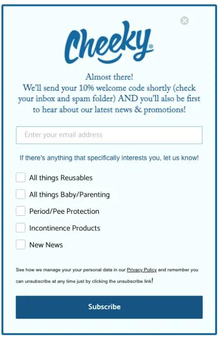
Cheeky Wipes uses their email pop-up to let subscribers tailor their experience with the brand. By adding checkbox preferences for future specific product recommendations, they allow subscribers to call the shots—and promise that they’ll only send relevant product offers based on their choices.
5. Ask for customer feedback
If you’re stumped on why a certain piece of your customer journey isn’t working, you can use pop-up forms to ask for customer feedback . We recommend testing this if:
- You have one specific question to ask.
- You’re seeing high website traffic but low conversion.
- You’ve already A/B tested abandoned cart emails.
- Your website analytics are showing a high number of “direct” sources.
Two of the most common pieces of information brands collect from a feedback pop-up are where people heard about them and why they’re not buying. If you want to know the former, trigger the pop-up after purchase. If it’s the latter, trigger the pop-up upon exit from a product page.
Common types of email and sign-up pop-ups to use on your website
Not all email and sign-up pop-ups are created equal. Some interfere with site interactions until they’re dismissed—which may be what you want, depending on your goal—while others sit on the sidelines, waiting for an interaction. Here are the most common types of pop-ups to consider:
Standard window pop-up
A standard window pop-up appears as a standalone window on top of a website’s content. As opposed to pop-up modals, which fully obscure website content, standard pop-ups obscure only a portion of the website and are usually easy to dismiss.
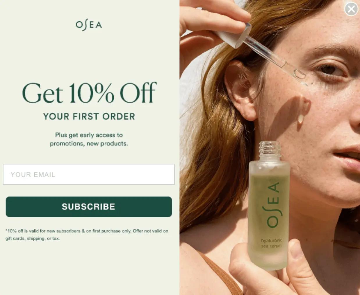
Your standard window pop-up design will depend on how prominent you’d like your pop-up to be, so make sure to define your goal before making any design decisions. This example from OSEA demonstrates what you can do with an eye-catching product image on a standard window pop-up.
Overlay pop-ups, or full screen pop-ups
Overlay pop-ups are considered the most intrusive form of pop-up because they obscure the entirety of the website’s content.
While it’s difficult to find an overlay pop-up in the wild as most brands tend to shy away from them, you may encounter one that serves a larger website goal.
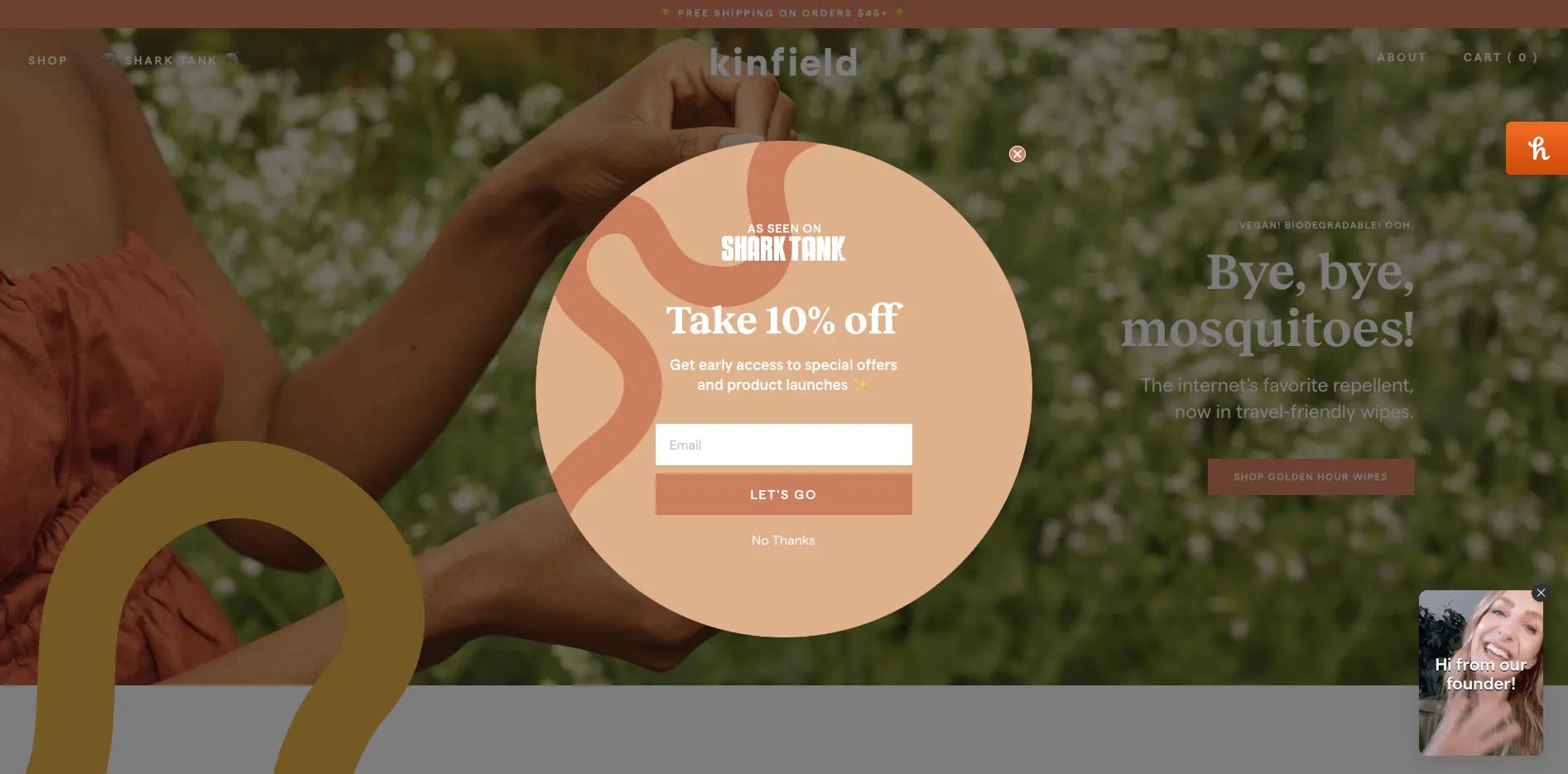
This example from Kinfield shows the potential for an overlay pop-up to serve several purposes, including a conventional email address capture alongside a video from the brand’s founder. To increase the odds of watching the video, the pop-up also says the founder was on Shark Tank—so they may be someone you want to watch.
Fly-out pop-up, or slide-in message
A fly-out email pop-up appears from the side of a website. It’s typically smaller than a standard window pop-up and doesn’t cover much of the page.
Fly-out pop-ups are often used as a less intrusive alternative to standard pop-ups, with the goal of capturing an email address after someone has had a chance to browse the website at their leisure.
This example from Aura Bora includes some customisation options and only appears after you’ve scrolled down a certain percentage of the homepage. It’s eye-catching, the offer is clear, and the brand gets to capture a lot of information—but the user doesn’t have to interact with it if they’re not ready.

Sticky bar
A sticky bar appears at the top or bottom of a website, and it can either be static or dismissable. While sticky bars are particularly useful for highlighting special offers, their use cases are almost limitless and the text can easily change depending on where the user is on the site.
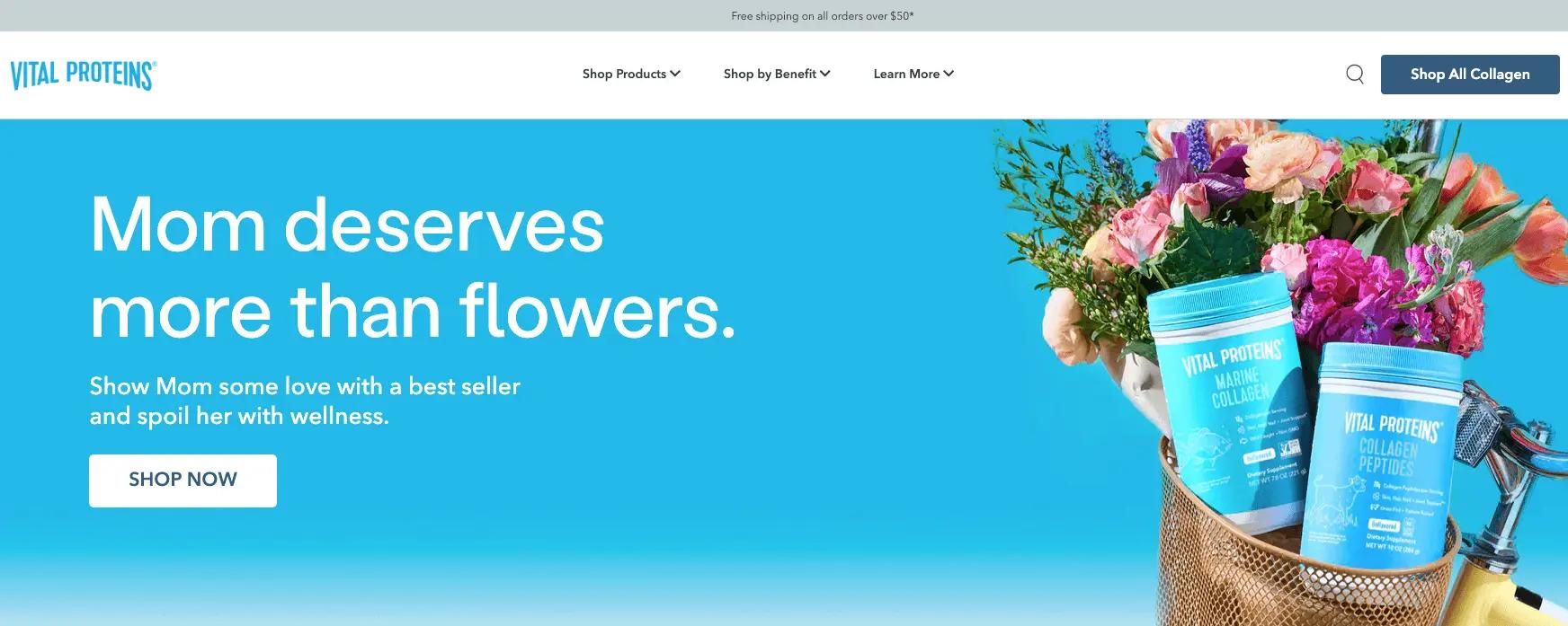
This example from Vital Proteins demonstrates what a multi-purpose sticky bar can do for a homepage. The text and link cycle through multiple announcements, from product highlights to free shipping notices.
9 email pop-up best practices
Now that you know how to conceive goals for your pop-ups and the options available to you, we’ll teach you how to write and design your best email pop-up. Follow this advice to increase the effectiveness of your pop-ups while minimising their intrusion on your website’s user experience.
1. Segment and target the right audience
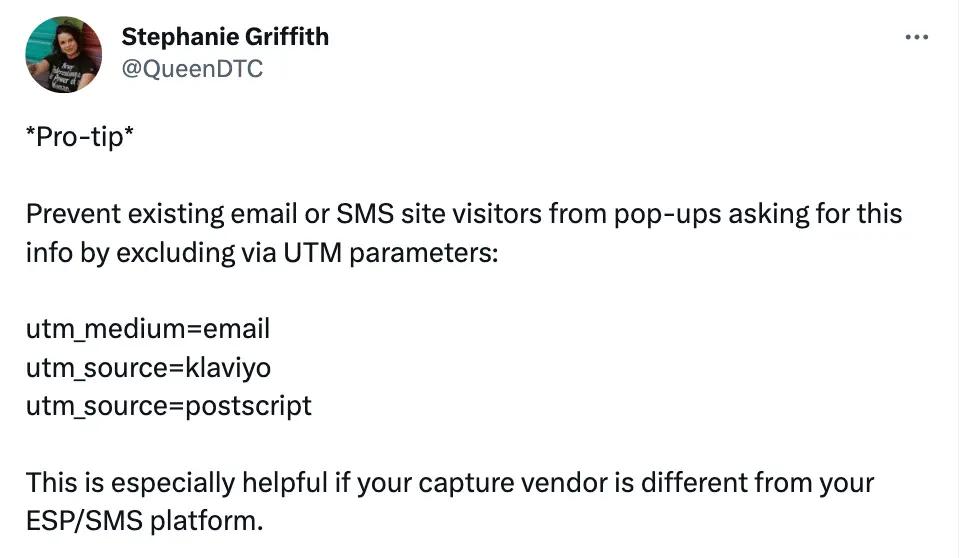
With email pop-ups, the people you exclude are almost more important than the people you include. If one of your goals is to make your pop-ups less intrusive, start by suppressing existing subscribers as an audience segment that shouldn’t see your pop-ups. If they’ve already converted, they shouldn’t need to see the pop-up again.
So what about audience segments who should see your email pop-ups? Start by crafting pop-ups for:
- New website visitors: introductory pop-up
- Returning website visitors: follow-up pop-up
- Customers who abandoned their shopping cart: persuasive pop-up
- Existing customers: special offer pop-up
You can also tailor your pop-up to website behaviour. This changes the context of the pop-up and therefore the copy. Create pop-ups for:
- Scroll depth: product- or section-specific pop-up
- Time on page: ask to subscribe after different time intervals
- Exit intent: last-ditch effort pop-up
2. Write a strong headline
A strong pop-up headline achieves the perfect balance of clear and unexpected.
You can afford to experiment a lot with your email pop-ups because they’re common and people are almost expecting to dismiss them—but it also means you’ll stand out if you get your headline right. While you should always aim to be clear over clever, a strong pop-up headline:
- Fits your use case and context. Tailor your headline to fit the goal of your pop-up.
- Encourages the visitor to pay attention. Experiment with wit, clarity, and compelling offers people can’t ignore.
- Represents the voice of your brand. Craft a headline that gives the visitor a taste of who you are.
Highlighting this Olipop example a second time, it may not surprise you that it’s an exit intent pop-up—meaning it appears when someone is trying to leave their website. The brand, known for its bright colours and cheeky copy, encourages people to stay on site with a pun. The headline fits the brand voice and the context for the pop-up.

3. Write simple and straightforward copy
Your email pop-up has one job: to persuade the visitor to subscribe to your emails.
Your best bet for capturing that email address is to be clear about the exchange. While you may be able to test clever vs. clear for your headline, your pop-up copy should always be more straightforward. It’s a promise you’re making to your subscriber: that you understand the privilege of obtaining their email address, and you won’t abuse it.
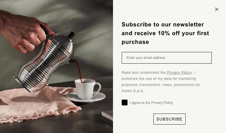
This example from Alessi doubles down on copy and leaves out a headline entirely. Alessi opts to communicate an offer and dedicate more space to their privacy policy, which offers GDPR-compliant transparency for how the brand will use the email address.
4. Offer an irresistible incentive
You can experiment with headlines and copy to the nth degree, but nothing gets someone to hand over their email address more than an incentive.
But if you don’t want to break the bank, you can get creative with testing different pop-up incentives . One of the best ways to do this is with a “spin the wheel” offer, which adds an element of gamification and doesn’t always lead to a discount.
5. Create an eye-catching design
Good design is subjective. What looks great for one brand won’t look so great for another. And keeping up with design trends is difficult if you don’t have access to a full-time designer.
This is why customisable templates are important. You’ll want to deploy your email pop-ups across many pages at scale, so you probably don’t have a lot of time to fiddle around with design—but a pop-up with good design can make a difference on conversion.
Some of the most important design elements of an email pop-up include:
- A modern font
- A lovely colour palette
- A great product shot
- A stand-out call-to-action (CTA) button
- A clean design with minimal fields (more on this later)
- Bonus: a photo that represents your audience
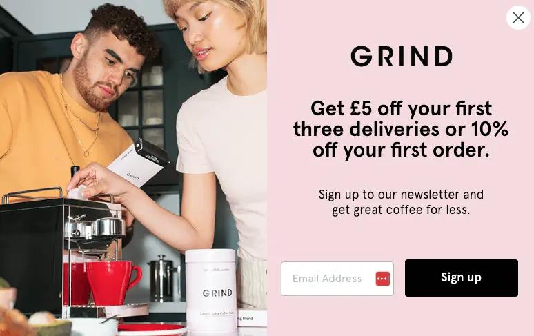
This example from Grind combines all of these elements into one. The brand colours pop against a product shot with people in it, and the font carries some flair that isn’t standard or outdated.
6. Keep fields to a minimum—but test additional fields to understand trade-offs
It’s a standard best practice to keep your number of email pop-up fields to a minimum. But for both email and SMS sign-up forms, Klaviyo’s data analysis revealed a correlation between form submission rate and the number of “components” on the sign-up form .
In other words, the more “complicated” the form, the better it performs.
As always, take that with a grain of salt—the differences did not reach the level of statistical significance, and our data also doesn’t distinguish between “components” and “fields”—meaning “components” could also simply refer to key features like coupon codes, teasers, etc.
But asking for additional information on your sign-up forms, as in the Cheeky Wipes example above, could help you mine the kind of Customer-First Data™ that proves invaluable in personalising your marketing messages later—assuming it makes sense for your brand.
On this note, multi-step forms are a good avenue for testing how your site visitors prefer to pass along their information.
A multi-step form allows you to collect more data points than just someone’s email. But because you’re gathering this information in separate steps rather than all at once, you decrease the likelihood of a potential subscriber forgoing the form all together.
7. Include a clear CTA
Your CTA button is the thing people click on to convert on your email pop-up, so needless to say, it’s important. Consider your CTA your last opportunity to express what the reader gets for clicking on it and subscribing.
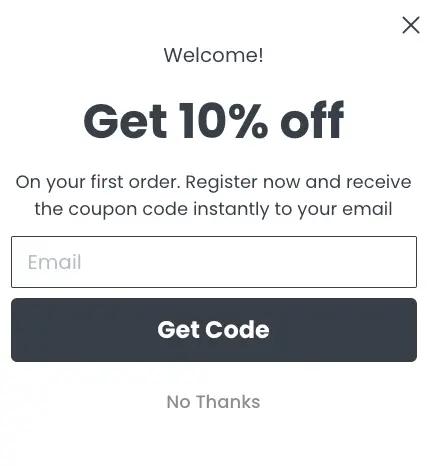
Basic design rules like a large button, good colour contrast, and minimal language are what make an effective CTA. But Zarina takes it a step further in this example, which uses a “Get Code” CTA to emphasise that the subscriber will get a discount. As opposed to a standard “Subscribe” CTA, the slight tweak in language indicates that a brand is giving something rather than getting something.
8. Consider less in-your-face pop-up types
If you want to test less intrusive types of pop-ups, consider these options:
- Sticky bars: These take up less space than a traditional pop-up but still provide a prominent CTA. You can also rotate text and links on one sticky bar, so in some ways they’re more versatile—even though you may see short-term conversions.
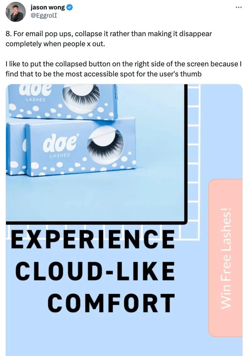
- Fly-outs, or slide-ins: Fly-outs can slide in and out on your website, and they’re a great option for mobile where space is limited. We recommend testing slide-in pop-ups based on where someone’s thumb sits beside their mobile screen to see if they perform better than they would on desktop.
9. Make your pop-up window easy to close for accessibility
When you’re designing your email pop-up experience, keep people with disabilities top of mind. This means ensuring your pop-up window adheres to accessibility standards and is easy to close for everyone, but most of all for people with motor and visual impairments.
Accessibility is a win-win for everyone because it means you’re giving people the choice to engage with your pop-up on their own terms. In addition to building trust and establishing a positive relationship with your audience, this allows visitors to browse your site without interruption.
How to set up a successful email pop-up in 3 steps
Setting up a successful email pop-up can help you grow your email list and increase conversions. Here are 3 essential steps to get you started:
1. Choose your offer
Your offer is the foundation of your email pop-up because it’s the incentive you’re offering in exchange for someone’s email address.
To create a compelling offer, determine what your audience wants. Do they:
- Respond well to discounts?
- Prefer exclusive access to certain products?
- Value your educational content so much that it can stand on its own as an offer?
- Prefer free samples of actual products?
What’s a standard offer in your industry category, and how can you do better than that? Answer these questions before designing your pop-up, so your offer is relevant and valuable to your target audience.
2. Set up the behavioural trigger
A behavioural trigger is the action a website visitor needs to take to activate your email pop-up to display on your website.
Choose from several types of triggers, including:
- Exit intent
- Scroll depth
- Time delay
Each trigger has its benefits and drawbacks, so you’ll need to consider your goals and website analytics when testing triggers on certain pages.
For example, time-delay triggers are great for engaging visitors who spend more time on your site, so you may want to use them on pages that see a higher time on site metric than others.
3. Monitor performance and A/B test
After you’ve built your email pop-up, you’ll need to track its performance and improve it through A/B testing . Some metrics to measure include:
- Total number of sign-ups
- Conversion rates
- Email bounce rates on pages where your pop-ups appear
To conduct an A/B test, choose one variable to test at a time, whether it’s your headline, CTA button, or completely different offers. Create two versions of your pop-up and test only that one element, so your results are clear. Monitor the results and make adjustments based on which version performs the best.
If your pop-up isn’t converting as expected, change the offer or trigger and re-test until you find the right combination that resonates with your audience.
Build your perfect email pop-up window
There’s still a lot of room for creativity in how you design and implement your email pop-ups , so you won’t know what works for your brand until you test.
But there’s no question about the need to turn website visitors into subscribers—it’s how you build a foundation for communicating with subscribers and customers in a style and tone that’s completely your own.
Email pop-up FAQs
Can you add email pop-ups on Shopify?
Yes, you can add email pop-ups to your Shopify store, either through Shopify App Store apps like Klaviyo, or with custom code that lives on your Shopify store.
Are email pop-ups effective at driving revenue?
Email pop-ups are effective at driving revenue. When you use email pop-ups to build your mailing list, you’re building an audience who’s receptive to product promotions, discounts, and ultimately becoming customers.
What is the difference between email pop-ups, overlays, and modals?
Website pop-ups, overlays, and modals are all types of on-screen window prompts that display on a website. Pop-ups are separate windows that appear on top of the website, overlays partially obscure website content, and modals fully obscure website content.
Use Klaviyo’s built-in email pop-up form templates to grow your list.
Learn more


